Don’t Be Spammy: 10 Email Body Content Tips to Help Avoid Filters

In the hierarchy of email marketing importance, it would seem that body content ranks lowest, as this can only be seen once the sender name and subject line have successfully garnered an open.
But, spam filters look at everything, including the copy and visual elements in your email’s body content, prior to letting your message into inboxes, so it’s just as important to prioritize this.
Let’s take a look at what you should and shouldn’t do with your content in order to bypass spam filters, maintain a solid email marketing sender reputation, and boost engagement (read: clicks).
Best practices for email body copy
Not only will these tips help you get past those tricky spam filters, they’ll also help your emails actually look good. When it comes to your email copy, here’s what you need to remember:
- Keep it short and sweet
- Don’t use spam trigger words
- Personalize your message
- Provide the option to view email in browser
- Use an effective call to action
- Include a physical address
- Make unsubscribing easy
1. Keep it short and sweet
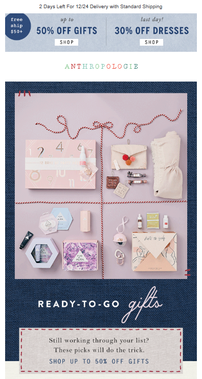
First and foremost, keep your copy simple. You need to explain your offer and provide an action for your reader to take in under 100 words, which seems daunting, but you should have at least one image complementing this copy to further communicate your offer.
Generally, people don’t want to read a long-form essay about your latest product, so shoot for concise paragraphs. Or, even better, bulleted or numbered lists. Your goal should be to pique interest just enough to get readers to click on your CTA, which should link them to a place with more detailed information on your offering.
As far as appearance, stick with fonts like Arial, Helvetica, or Verdana, as these are easy to read and commonly used across all ISPs and email clients. Your primary goal should be readability, so keep font sizes in the 12-16px range, and be sure to pick a color that contrasts well against your email’s background.
Oh, last thing: Please, please proofread. Send out test emails to get second, third, and fourth sets of eyes on everything, because spam filters and subscribers don’t look kindly on typos.
2. Don’t use spam trigger words
Within that precious copy, be sure to not use any of these 475 spammy words.
Spam filters evaluate some words (as well as practices like ALL CAPS and rampant enthusiasm!!!!!) more harshly than others, so there’s no exact formula to follow when writing.
Overall, if your offer comes off as aggressive, sneaky, or cheapened by the wording, it will likely raise concern with a spam filter. And, if not with a spam filter, then with subscribers themselves.
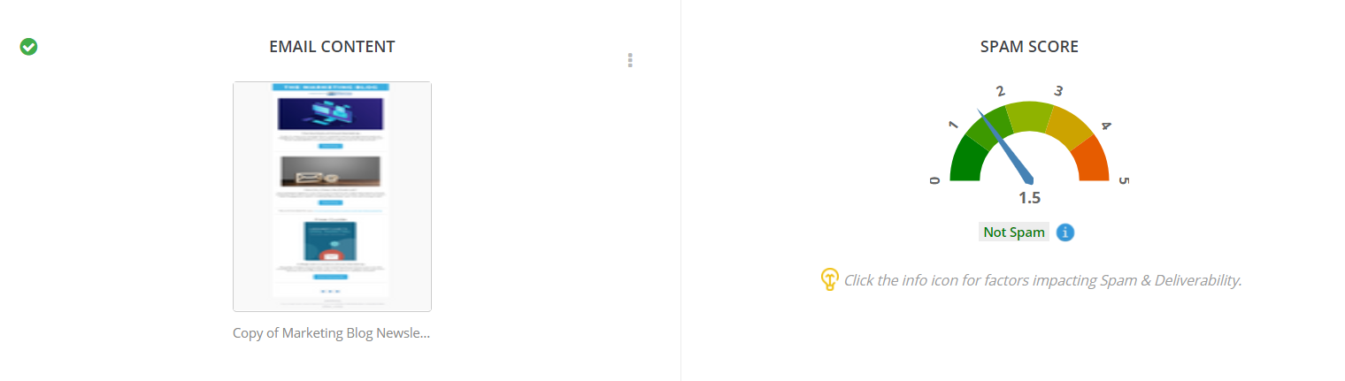
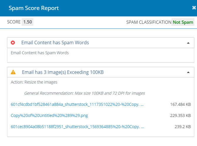
Mirabel’s Marketing Manager has a built-in spam-score checker that identifies any potentially spammy content and lets you know what to optimize.
3. Personalize your message
If you’ve ever received an email that addresses you by first name, it’s not, I’m sorry to say, because a company took the time to send you a special message.
Instead, the company’s digital marketing coordinator likely used a merge tag for first names to make the email seem more personal to everyone receiving it. This can both prove to spam filters that you actually know your recipients and boost engagement rates.
Addressing subscribers by their first names isn’t the only way to create a personalized email experience. You can (and should) also use segmentation to create smaller audience groups based on shared traits like geographical location or shopping preferences to provide them with targeted, relevant content that’s sure to generate higher open and click-through rates.
4. Use an effective call to action
As is the case with all call-to-action buttons, the focus should be on action-oriented copy and eye-catching colors.
Don’t get too wordy; a simple “Shop now” or “Start free trial” will do the trick. But, make sure the text and button colors both complement and contrast each other so your CTA captures attention while still being readable.
Above all else, make sure your CTA works. It should link to a product or landing page directly related to the offering in your email, and it must be easy to read and click on in mobile and desktop inboxes.
5. Provide the option to view email in browser
Just in case an email client’s feeling a little devious and distorts your message’s design, always provide a link that allows subscribers to view your email in all its glory via browser.
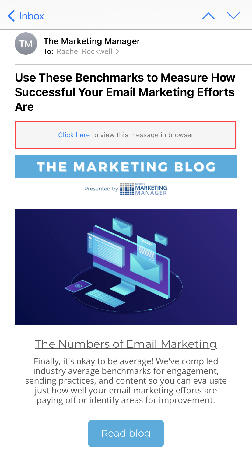
Typically, email service providers include this in every email, and they’re usually found in the header, as in the above example, or the footer, where the physical address and unsubscribe link reside.
6. Include a physical address
Speak of the devil. If you check the footer of nearly any email in your inbox right now, you’ll likely find a physical address. That’s because the CAN-SPAM Act requires it.
A physical address can be a company’s headquarters, P.O. box, or a private mailbox. This is essentially a second form of identification that lets spam filters and subscribers know you’re real.
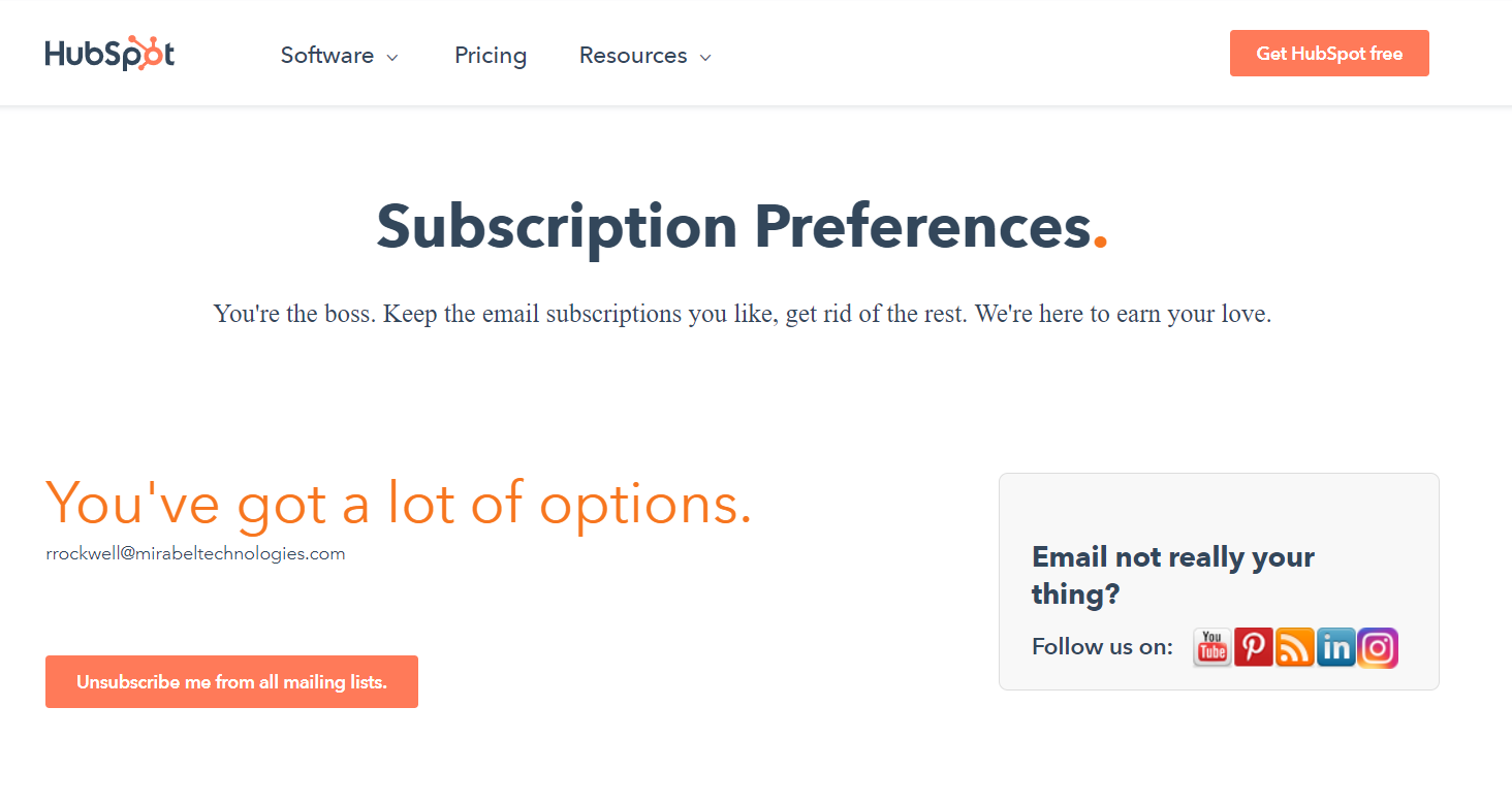
7. Make unsubscribing easy
Another thing legally required by the CAN-SPAM Act, but that also looks good to spam filters, is an unsubscribe option.
Elsa from Frozen had a point when she sang, “Let it go, let it go, can’t hold it back anymore.” If a subscriber wants to opt out of receiving your campaigns, let them, and make it easy for them to do so.
By easy, I mean:
- Place the unsubscribe button or link in an obvious place, such as the footer of your message, because that’s the first place an unsubscriber will look for it.
- Feature a simple action, like clicking a button or unchecking a box, on your opt-out form to finalize the unsubscribe.
Best practices for email body images
A marketing email is nothing without its visuals. They play a huge role in complementing the copy, elevating the overall message, and capturing readers’ attention, but they also increase your chances of getting flagged as spam by spam filters if not correctly implemented.
To make the most of visuals in your email marketing campaigns, you should:
- Avoid using videos or too many images
- Use optimal image sizes and formats
- Include alt-text for all images
8. Avoid using videos or too many images
Typically, spam filters begin blocking emails when they exceed a weight of 100 KB. Thus, utilizing heavy media formats like video or multiple images are surefire ways to weigh down your message.
If you really want to feature a video, include a screenshot of it that’s hyperlinked to the real thing.
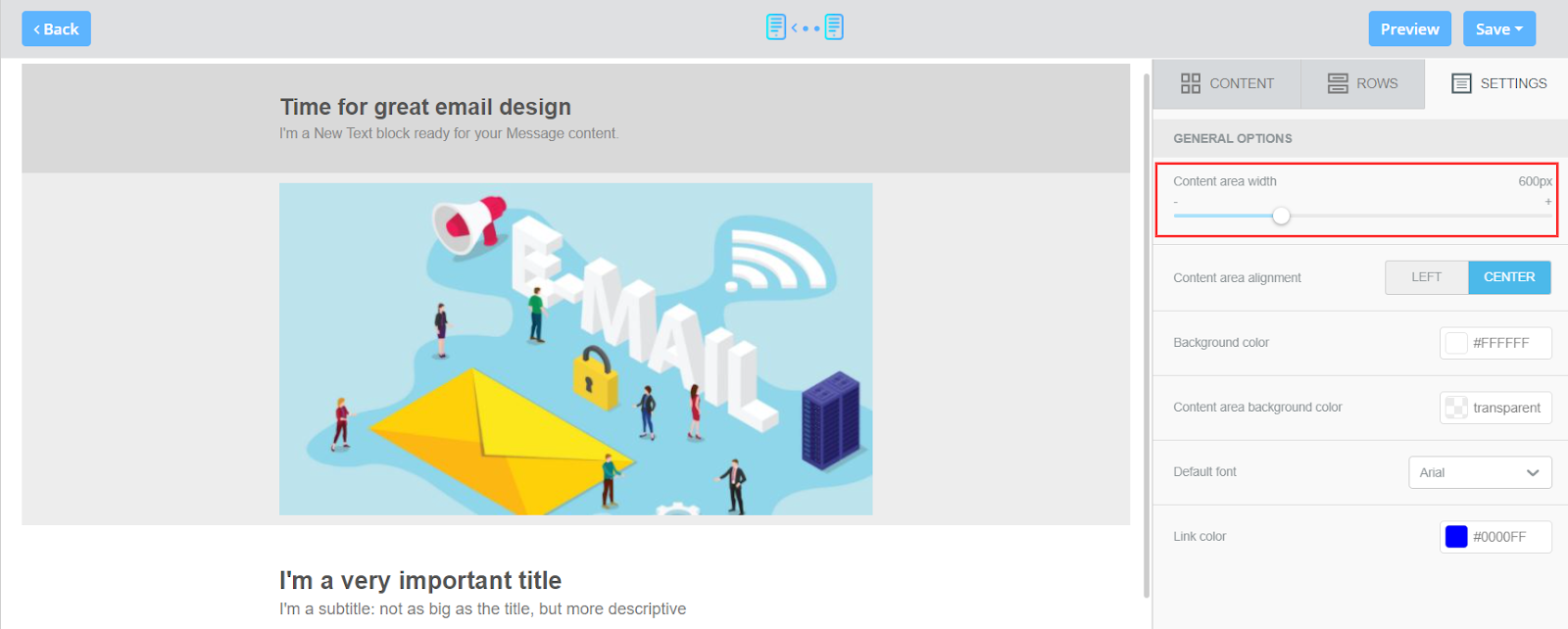
9. Use optimal image sizes and formats
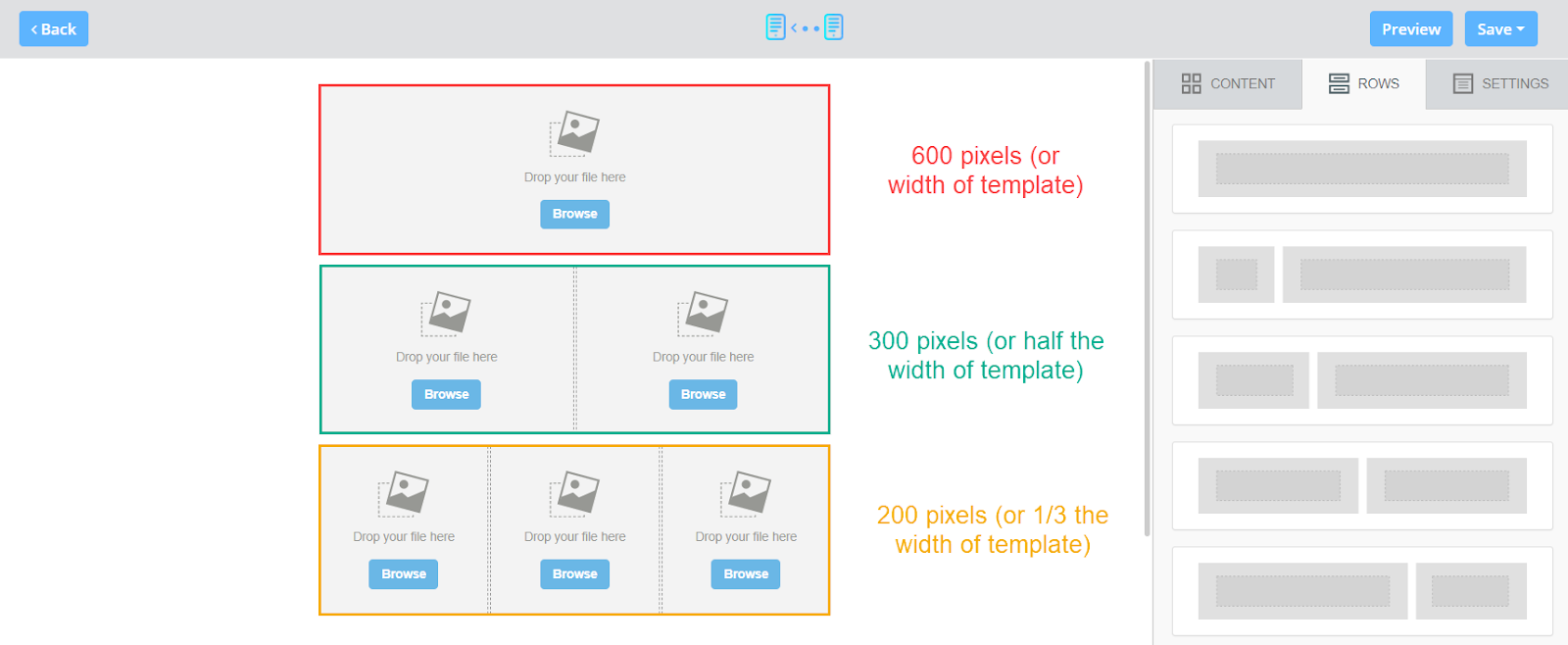
The ideal width for an email is 600px, and your images’ widths should be double that of your email template (so around 1200px for a banner/header/main image). The minimum size should be the actual width of your email (so 600px).
If you’re using multiple columns in your email, the same rules apply, but the size should be double the width of the column. So, if it’s a two-column section, each column’s width will be 300px, meaning the size of the images going in those slots should be a maximum of 600px and a minimum of 300px.
When it comes to image formats, they should only be PNG, JPEG, or GIFs.
Keep in mind that while PNGs and GIFs maintain an image’s high resolution and quality, they weigh more, whereas JPEGs weigh less, but because they significantly compress images and reduce the quality in the process.
10. Include alt-text for your images
Alternative text gives context for images when an email client blocks them from loading and provides accessibility to sight-impaired subscribers who can’t see your visual elements.
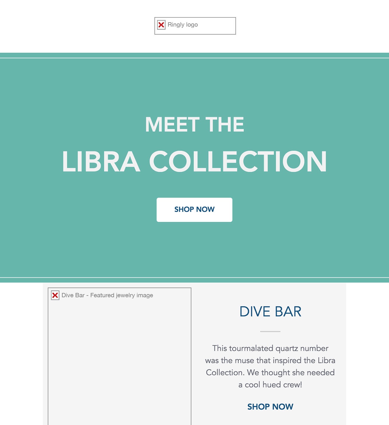
Strong alt text should describe an image as specifically but succinctly as possible. There’s no need to include “image of” in your text, as that’s implied. Oh, and if you’re using an image as your primary CTA (which I don’t recommend), make sure the alt text includes an actual call to action. You can use images as supplementary CTAs, however, so make sure they’re hyperlinked.

Wrapping up
Hopefully you now see why I initially said your email body content is just as important as the sender name and subject line.
While the latter two will mostly impact your delivery and open rates, your body content’s success will be reflected in your click-through, click-to-open, and unsubscribe rates, all of which are vital KPIs in the email marketing game.
Planning, creating and reviewing your emails’ contents may require a bit of extra time, but the results will be worth it.
SEE FOR YOURSELF
Watch an overview to learn how B2B marketing automation by Mirabel Technologies can help you increase traffic, optimize your funnel, drive more leads, improve conversions, and boost ROI — at a price you can afford!
