Where The Action Is: How To Create An Effective Call-To-Action

In the Digital Age of endless choice and opportunity, a successful digital marketing campaign is incomplete without a proper call-to-action (CTA). In fact, 47 percent of websites have a clear CTA that takes readers 3 seconds or less to see. Why?
A call-to-action moves your audience forward. Think of the buying process: It begins with a problem that needs a solution. While doing research on solutions, your audience clicks around your website to gain information. If they feel confident in the product or service you offer as their solution, they’ll want to know the next step.
“How do I get more detailed information? Is there someone I can talk to directly? Do you offer a free demo or trial period?”
To get to that next step, they need to see a call-to-action. Without it, they’re left stagnant. They become a cold lead, and you potentially lose a sale. With it, your lead is nurtured to your product or service as a solution. A CTA is designed to move your lead forward, to help it through the buying process.
Throughout this blog, we’ll explore:
- When, where, and why these buttons are so valuable for the success of your marketing strategy
- Examples of successful CTAs
- CTA design best practices
The 5 Ws of CTAs
Before we get into the details of CTA best practices, let’s further discuss what a call-to-action is, its functionality, and more. Taking a cue from our publication clients, we’re breaking it down by the 5 Ws:
Who is a CTA for?
CTAs are targeted toward high-quality leads, visitors who are most likely to convert by filling out a form. A great CTA goes a long way in nurturing a high-quality lead into a customer. As they say, “It started with the click of a button.”
What is a CTA?
CTA stands for call-to-action. It’s a button on a website, landing page, or other web page that prompts a visitor to take a specific action. The main goal of a CTA is to increase conversions by prompting visitors to contact you, download an offer, RSVP to a virtual event, and so on. CTAs can also increase your click-through rate, which is the number of pages an average visitor views when visiting your site.
When should you use a CTA?
In a successful CTA strategy, it’s all about understanding the key opportunities to convert high-quality leads. CTAs push leads forward, and you don’t want to overwhelm a lead with too many CTAs.
Where should you place a CTA?
As mentioned before, placement is everything. This button serves as the lead’s final destination before converting, so choose your web pages wisely. A few common CTA placements are as follows:
- Above the fold on your home page, prompting more information
- At the end or in the middle of a blog post, prompting a relevant content offer
- At the end of a lead-capture form on a landing page, prompting a gated content offer
- Before users are prompted to leave your page, prompting a “before you go” pop-up
You can also find built-in customizable CTAs on social media pages, Google, and other complementary marketing tools.

Why are CTAs important for your overall marketing strategy?
Every step of your digital marketing strategy needs to be efficient and effective. With the right CTAs, you can subtly nurture your web visitors to take a specific action without being too aggressive or salesy.
What Makes a CTA Button Clickworthy?
Now that we’ve covered the basics, let’s dive into what makes certain calls-to-action more clickworthy than others.
Understanding what it takes to create an effective CTA will directly translate to your success rate. Did you know more than 90 percent of web visitors who read your website’s headlines will also read your CTA copy?
That’s likely because of proper placement, and a well-designed and integrated CTA button leads to relevant content and demonstrates similar branding. This button serves as a natural next step forward and offers a seamless transition in the buying process. Ensure you’re giving your audience a reason to click your button. Here’s how you can prompt that organic transition and ensure that your CTA is generating a real impact:
Use strong copy that promotes action.
When thinking about copy, use words that drive and inspire your digital audience to take specific action. How you phrase the copy of your CTA should directly align with branding, messaging strategy, and content marketing efforts.

Create a sense of urgency.
A sense of urgency and/or a time limit sparks a feeling of necessity amongst your digital audience. Use words or phrases like “hurry” or “now.” If you’re technically savvy, include countdowns surrounding your CTA. Your audience never wants to miss out on something.
Hone in on the value of what you have to offer.
Your messaging should always aim to showcase the value of your offer. You’re offering a solution to a problem, so pose that value when creating your CTA buttons. Use the space (with complementing white space) within your CTA to align your brand and highlight the most important reason why your audience should click: You offer a solution to their problem.

Get personal. Find out what matters most to your audience.
If you choose to blend persona research and calls-to-action, you can personalize and curate each button based on known demographics. This effective strategy shows your digital audience that you care about their needs while gathering hard data on your target audiences.
Best Practices for CTA Design
You know why you need a CTA button, who it’s for, and where to put it. Now, how do you design it? Just as your copy across all marketing materials needs to mirror brand messaging, CTA design and style choices need to mimic the design of your brand.
Text on Your Button
Like mentioned above, it’s important to include copy that features action words. Action words explain exactly what your audience needs to do and what they’re getting. It’s also important to consider the font, size, and style of text (bold, italics, etc.) for your button.
Generally, the font needs to be clearly legible and match the font on other web pages, especially the page that the CTA is on. The font size needs to be larger and be surrounded by enough white space to stand out.
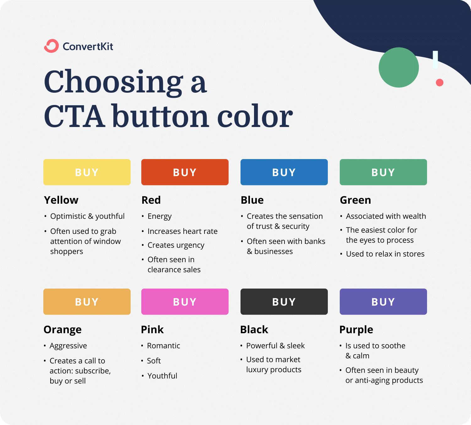
Button Color
Color theory in the marketing industry plays an important role. Your CTA should fall between what makes an impact and what mirrors your brand. For example, contrast colors were found to be more actionable, especially orange and green, and get more conversions. SAP found that orange CTAs boosted their conversion rate by 32.5 percent.
Shape and Size
The size and shape of your CTA also makes a difference in its effectiveness. The shape subtly speaks to the approach ability of your brand. Various research explains that curved-cornered buttons are more clickable than sharp corners.
Additionally, the size of your button matters. Your CTA needs to be easily read but not too large and overwhelming, bordering cheesy. While this may seem like a small detail, it’s worth considering if it means you’ll generate more conversions.
White Space
Including white space around your CTA ensures that it stands out and makes an impact. Without white space, your button would get lost in other copy and design on the page. White space around a CTA highlights your goal and makes it more actionable and accessible.
How to Get the Perfect CTA
CTAs may seem smaller in relation to your other content marketing, but they play a huge role in the buying process. Remember: It all starts with a click. Make that click count by adhering to CTA design best practices, sticking to messaging strategies, and placing it on proper pages to nurture a lead — not scare it away.
For more information about the basics of digital marketing strategies, download A Beginner’s Guide to Email Marketing by Mirabel’s Marketing Manager. Click on the button below to grab your copy today:
SEE FOR YOURSELF
Watch an overview to learn how B2B marketing automation by Mirabel Technologies can help you increase traffic, optimize your funnel, drive more leads, improve conversions, and boost ROI — at a price you can afford!
