8 Quick Tips for a Perfect Mobile-Friendly Landing Page

Take a moment to think: How do you get most of your information every day? How do you shop for something when you’re on the go? How do you communicate with friends and family? Chances are you’re like most people nowadays, attached to and reliant on your mobile phone.
For digital marketing teams, this transition means an adaptation to create and deliver content specifically for mobile. It doesn’t matter what industry you belong to, learning how to create a mobile-friendly landing page and website is a necessity.
If you’re wondering how to create a perfect landing page, you need to ensure that your landing pages are well-suited and adaptable for desktop and mobile. One of the main goals of a landing page is to increase conversion rates, so it’s important to keep top of mind that 53.3% of web traffic is now mobile.
With over half of users visiting via mobile devices, your ability to optimize your content for smaller screens is a crucial part of your digital marketing strategy. Otherwise, you’ll lose out on potential conversions, because your landing pages are hard to navigate and/or slower on cell phones and tablets.
In this article, we’re going to focus on why you need to optimize landing pages for mobile and how to create the perfect landing page with industry best practices.
Why is Mobile Optimization Important?
While mobile web traffic recently started to outperform traditional desktop traffic, mobile conversions still lag behind desktop conversions. This is primarily due to digital marketers not creating and optimizing their landing page content to fit seamlessly with mobile browsers.
The fact is only half of all landing pages are optimized for cell phones and tablets. By not catering their content to mobile platforms, marketing teams are ignoring half their potential conversions.
However, 86% of the top landing pages, which are mostly home pages to websites, are mobile-friendly. This marketing statistic proves the effectiveness of creating content that adapts to mobile devices. It’s a beacon of hope for marketing teams that strive to reach audiences beyond the desktop.
Tips for Mobile Landing Page Design
You know that conversions on mobile devices are valuable for your content marketing strategy. Yet, do you know how to create mobile landing pages? Because mobile-friendly landing pages facilitate conversions and provide a smooth user experience, this is an important design consideration.
Software like Mirabel’s Marketing Manager can help boost your conversions with web visitor tracking and other analytic tools, but here are our top pieces of advice on how to create a landing page for mobile devices:
- Create landing pages that are specific to mobile devices.
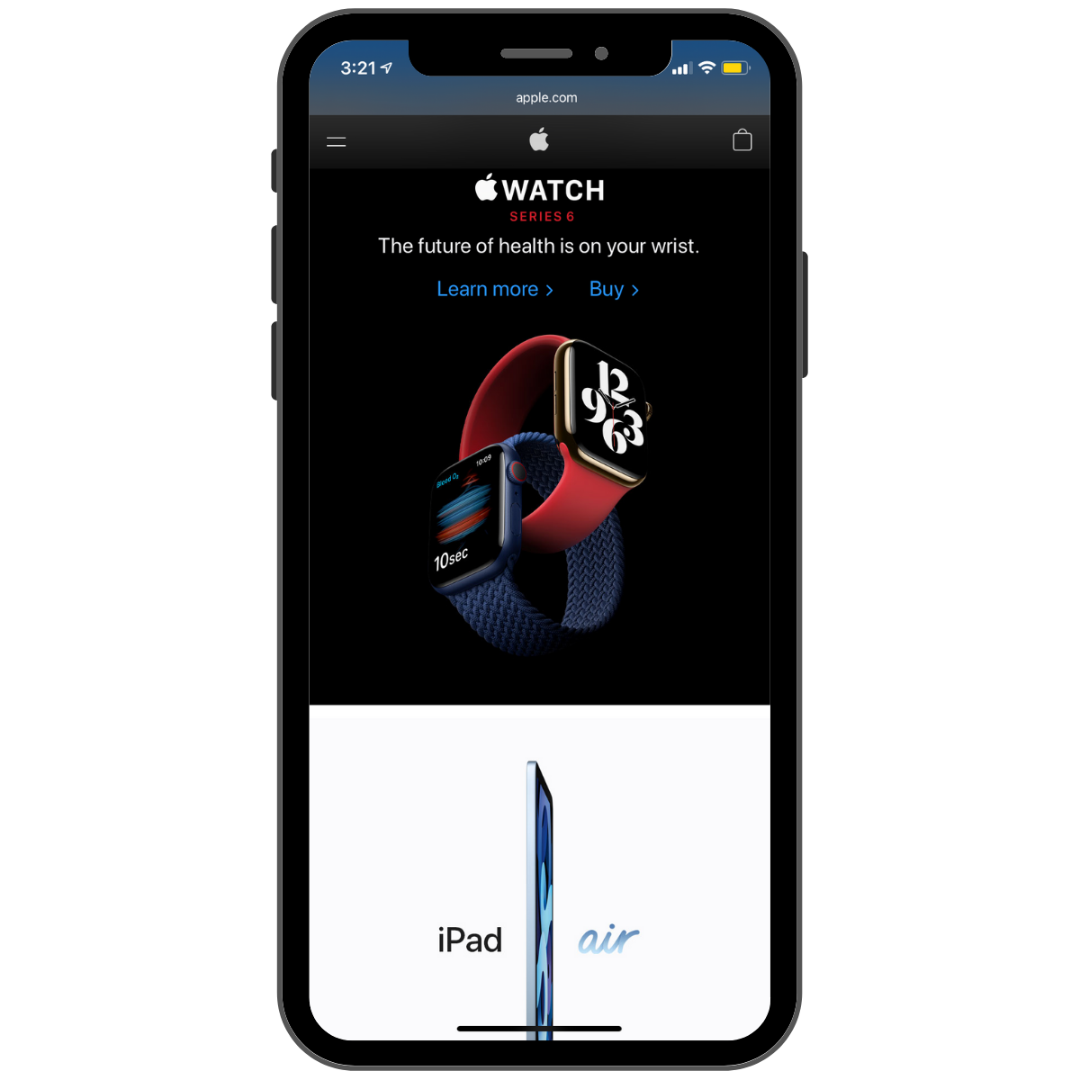
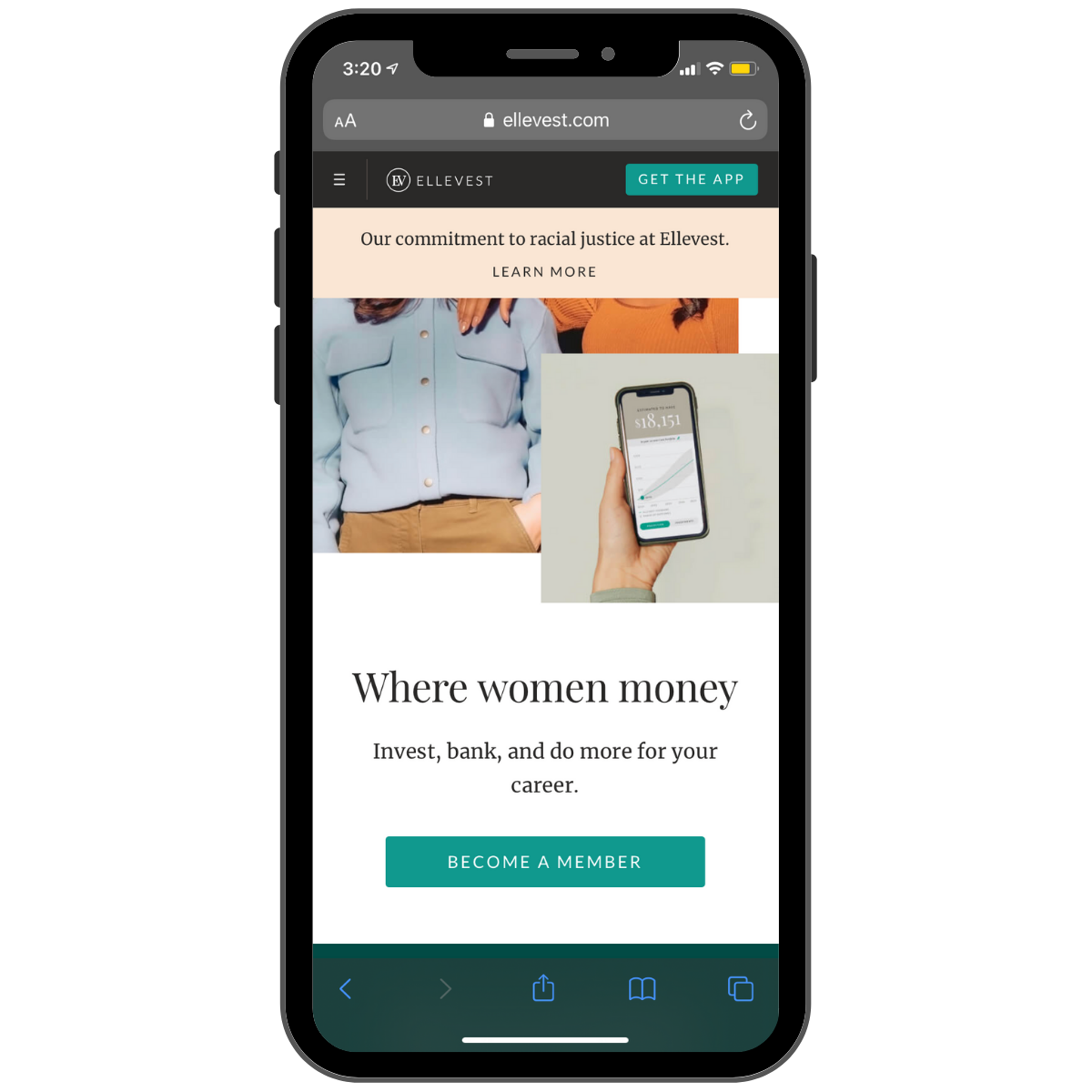
It’s a good idea to create websites and landing pages that are mobile-responsive. It’s great to create separate landing pages that are specific for mobile devices. To secure a high conversion rate for your marketing campaigns, don’t copy and paste from desktop-designed landing pages. Design separate landing pages that are to be featured on phones and tablets.
If you skip this extra step and use a mobile-responsive design, you aren’t actually adapting to the best user experience on mobile devices. Instead, you’re finding a way to squeeze the content onto a smaller screen. This can cause calls-to-action (CTA) and forms to shift, as well as slow load times and a higher exit rate.
Take the time to map out your audience’s buyer journey, both on desktop and mobile. Identify the similarities and differences between both user experience to build an optimized mobile and desktop journey for both screens.
- Keep your copy short and sweet.
With an influx of mobile content, your audience’s attention span is likely to be shorter. After all, they have a world of information in the palm of their hand.
Because of this, it’s important to keep your copy concise and clear. Start with a great headline. It’s so important, because eight out of ten visitors read your headline, and only two will read the rest of your landing page. If you aren’t able to hook your visitor with a clear, concise headline, you risk increasing your exit rate.
Following your headline, use bullet points, and cut out the fluff. Use straightforward, easy-to-read language in shorter sentences. Despite these parameters, don’t be afraid to get creative. Showcase your brand’s values and tone, because your product or service is really what got them to your landing page in the first place.
- Place your CTA at the top of your landing page.
Conversion rates don’t equate to scrolling time. While a longer scroll time is definitely better, keep in mind that the content that sits at the top of your landing page will grab their attention first.
Use this prime real estate to draw attention to your CTA, which will inform visitors what they will receive from your page. By drawing attention to the CTA from the get-go, you enhance the comfort, ease, and accessibility of your mobile page. You’ll also put the goal of conversions front and center. Don’t let your visitors get lost on your landing page before they even start to explore.

- Use a single-column layout.
How you design your landing page for mobile should be very different from how they appear on the traditional desktop.
Consider organizing your content to mimic the ease and directness of social media channels. Social media apps on mobile display content for users to see and engage with in a single scrolling motion.
When you’re on your phone scrolling through Instagram or Facebook, you never have multiple columns vying for your attention. Instead, you’re encouraged to scroll through a single long column that features images, copy, and other content one at a time.
The same methodology should be applied to how you approach mobile landing pages. Mobile-friendly landing pages that feature a single column are easier to navigate through, ultimately improving your user experience.
- Don’t overwhelm your audience with too many visuals.
Regarding digital organization and content layout, it’s important to remember that it’s more than OK to include white space on mobile landing pages.
With a smaller screen, it’s easier to overwhelm your audience with too many visuals and striking images. Remember to curate a landing page that’s engaging but doesn’t distract from your CTA.
By including white space, contrasting colors, and a few powerful visuals, you can isolate your elements to create a clean landing page design. The visuals should be carefully curated to enhance the understanding of your product’s function or your service’s capabilities.
It should also always specifically cater to your target customer. This way, you can create a mobile landing page that’s enticing but not overbearing.
- Optimize your landing page with easy navigation.
Another marketing strategy to enhance the mobile user experience on landing pages is to include optimized navigation features. Like with desktop landing pages, mobile landing pages don’t include much navigation, as this could steer your potential conversion away from converting.
Features like sticky headers and footers may suit the goals of your page and allow your visitors to have a smoother user experience. “Sticky” features means that as a user scrolls down the page, the navigation follows. This is great, as a user always has access to other important pages, like a menu of other products, the home page, and/or a shopping cart.
Condensed navigation menus are also a great marketing strategy for mobile landing pages.
- Adjust the forms to mobile-friendly formats.
When attempting to gather information from users via mobile devices, be sure to change the layout of the landing page forms to match the user experience of your mobile landing page.
The way you organize your forms is extremely important if you want to ensure that your visitors fill them out. When considering what fields to include in your form, less is always more. Simplicity is key when asking for information; otherwise users feel overwhelmed or like you’re asking for too much or invading their privacy, even in mobile.
When developing your form, include only the most important information you need. This is commonly the first name and email address. Some forms ask for the last name or phone number as alternate means of communication. Don’t get greedy when deciding form fields.
- Cut down on your landing page’s load time.
Lastly, always test the load times of your mobile landing pages. When it comes to browsing through content on mobile devices, the quicker the better.
Nowadays, we’re used to everything being instantaneous. Because of this, you don’t want to risk potential conversions before they see your content because it took longer than 3 seconds to load.
If a landing page visitor bounces before the page fully loads, it’s likely that they won’t return to your page any time soon. By keeping your load speeds efficient and fast, you’ll have a better chance of effectively connecting with your page’s visitors.
To check your landing page’s mobile and desktop load times, and to receive insights on how to improve them, Google’s free PageSpeed Insights tool has you covered.
Conclusion
When you design a desktop landing page, the same marketing strategies apply for mobile pages. However, remember the few key differences of your landing page design regarding how mobile users expect to experience content.
Implementing these key difference-makers will provide a smooth user experience and generate conversions that meet the goals of your marketing strategy.
With these landing page tips in mind, you’ll be better suited to developing mobile landing pages that effectively grab the attention of users and make a lasting impression.
SEE FOR YOURSELF
Watch an overview to learn how B2B marketing automation by Mirabel Technologies can help you increase traffic, optimize your funnel, drive more leads, improve conversions, and boost ROI — at a price you can afford!
