Construct and Convert: 10 of the Best Landing Page Design Tips

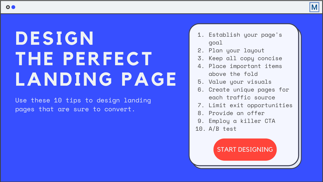
Table of Contents
- 1. Determine a goal for your landing page
- 2. Plan your layout
- 3. Keep copy concise
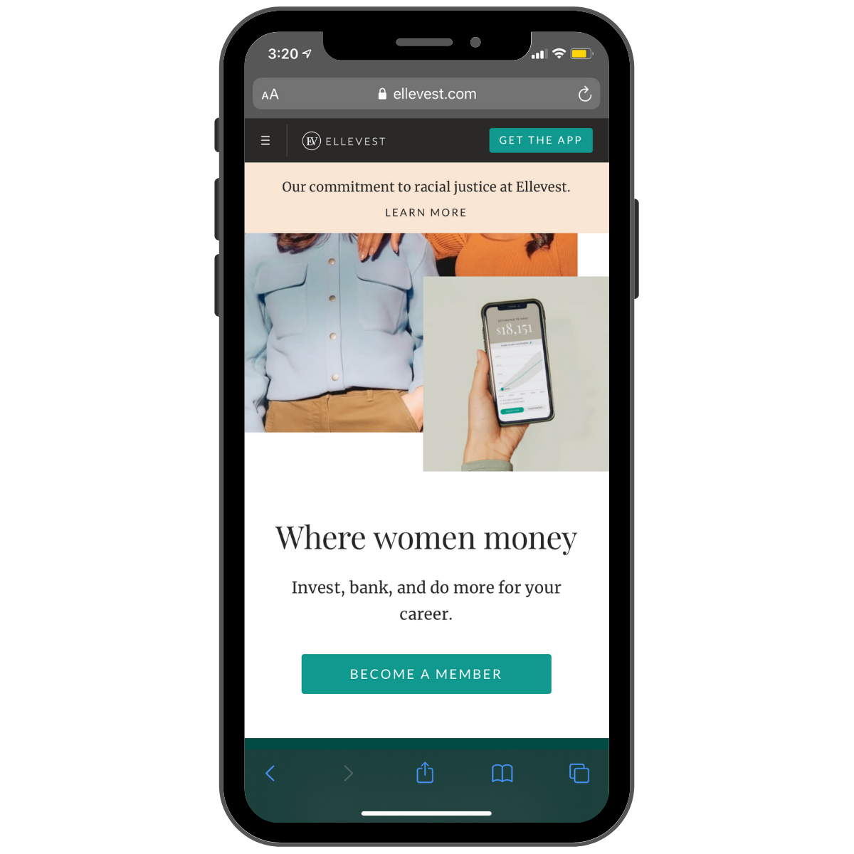
- 4. Prioritize above-the-fold positioning
- 5. Value your visuals
- 6. Create campaign-specific landing pages
- 7. Limit distractions and exit opportunities
- 8. Encourage a conversion with an enticing offer
- 9. Ensure a conversion with a killer call to action
- 10. A/B test to maximize conversion opportunities
- Time to Stick the Landing (Page)
So, you’re creating a new landing page. That’s great! Landing pages are prime opportunities to convert your website’s visitors into leads.
To increase your conversion rate, the landing page design needs to provide a smooth user experience. To get that smooth user experience, keep these 10 landing page design ideas in mind.
1. Determine a goal for your landing page
According to Toptal, landing pages exist to propel conversions. So, you need to ask yourself what type of conversion are you hoping to propel? The most common conversion goals include:
- Building brand awareness. This involves growing your email subscriber list and building a relationship with these individuals via content about your brand as well as your products/services that ultimately results in a loyal following and customer growth.
- Lead generation. This involves capturing the contact information of prospects interested in your product/service so a member of your sales team can then follow up.
- Sales. This aims to facilitate quick purchases by showcasing a specific product and providing users with the ability to add to cart or buy without ever leaving your landing page.
Defining your goal is vital to the planning process, as it will influence your landing page’s design.
2. Plan your layout
Regardless of the goal, a good landing page should have the following five elements:
- A headline
- A brief description of your offering
- Relevant imagery
- A lead-capture form
- A call-to-action
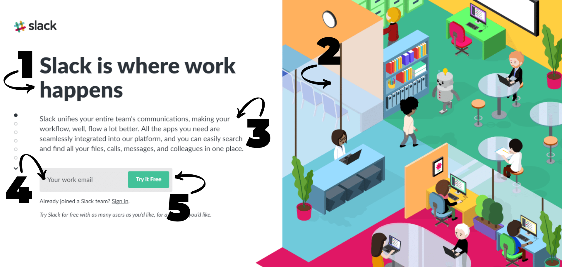
Now, let’s dig into what you can do to make each of these elements the best they can be.
3. Keep copy concise
When it comes to your headline and description, focus on succinct messaging. Easier said than done, but it’s vital for the user experience.
Your focus should be stating how your brand or offering can benefit users via simple, plain language. Then, if you so desire, you can elaborate below the fold.
Speaking of folds…
4. Prioritize above-the-fold positioning
Always keep the most important information and call-to-action at the top of the page. By doing this, you ensure that no matter where the fold, or bottom of your browser window, ends up, visitors still get an essential snapshot of what you’re offering and where they can take action.
With that being said, this doesn’t mean your landing page can’t have content below the fold. While the main goal for above-the-fold information is to grab visitors’ attention, you want them to keep scrolling to learn more.
For this reason, Neil Patel considers the whole concept of a fold a “myth.” This landing page design tip can help increase conversion rates.
5. Value your visuals
Remember earlier when I said you only get eight seconds to make an impression on visitors? Well, in general, people process images quicker than text, so incorporating them on your landing page works to your advantage.
If using an image or images, especially a banner or header image, it should be attention-grabbing and complement your offer in visual form.
You can embed a video on your page as the visual element as well. Videos are great for demonstrating complex offerings like software, for example.
Regardless of the types of visual elements you choose to include, it’s recommended that at least one resides above the fold. You can take advantage of below-the-fold real estate to better showcase your offering, but don’t go overboard.
One last thing about visuals: make sure they’re responsive on mobile devices! It’s estimated that as much as 70% of web traffic is now mobile, and that number will only continue to grow as we continue to be addicted to our phones. Optimizing your landing page for mobile so it looks good, loads quickly, and is easily navigable requires some extra effort but when your conversion rates dramatically increase, you’ll be grateful you took the time.
6. Create campaign-specific landing pages
Consider how you’ll get your landing page in front of a digital audience. Will it be through email marketing? A monthly newsletter? Social media posts? Maybe Google Ads?
If the answer is more than one of those marketing strategies, it’s worth creating individual landing pages for each channel. This can help you track things like which traffic sources were successful.
If you decide to do this per-traffic source route, keep the landing page design similar to the source. For example, if you create an Instagram Ad featuring a specific headline and image, include those exact design elements on the Instagram campaign’s landing page.
7. Limit distractions and exit opportunities
One of the most recommended practices for landing page design includes limiting exit opportunities.
Remove your website’s navigation bar, don’t include any internal or external links, and don’t mention related offers. You want your landing page’s visitors focused solely on filling out your lead-capture form and generating a conversion.
In regard to social sharing buttons, some marketing companies recommend including them below the fold. This allows your content to be shared seamlessly across Facebook, Twitter, LinkedIn, and so on. Other marketing companies recommend excluding them entirely to keep with the rule of limiting exit opportunities.
Consider running an A/B test between different landing pages to see if adding social sharing buttons has a justifiable ROI.
8. Encourage a conversion with an enticing offer
Removing exit opportunities keeps website visitors focused, but enticing them with something extra all but guarantees a high conversion rate.
In exchange for a website visitor’s email address, offer a discount, a helpful resource like an ebook, or a free trial. The gated content options are endless, but ensure the content offer relates to your product or service.
Once you’ve convinced visitors your offer is worth it, don’t immediately dissuade them from converting with a needlessly long lead-capture form.
Your landing page form should be short; most only ask for a first name, last name, and an email address. Depending on your landing page’s goal, of course, sometimes a little more information is necessary, but this just means you’ll have to make your offering really worth the exchange.
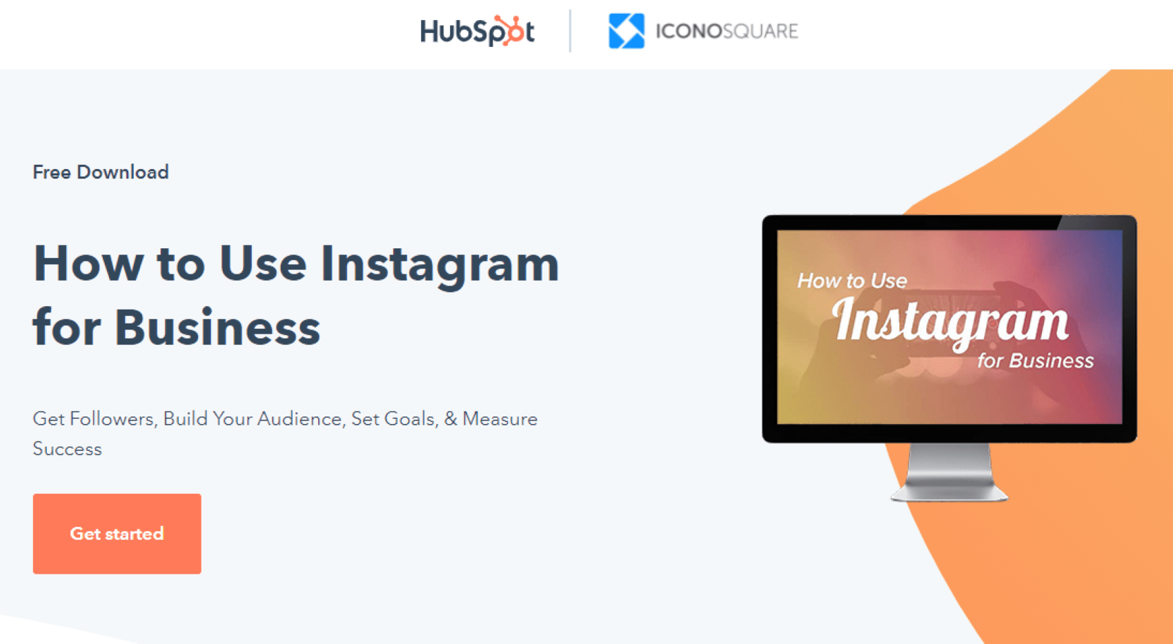 Hubspot offers free ebooks, including this one on how businesses can use Instagram (above), in exchange for basic information (below).
9. Ensure a conversion with a killer call to action
Finally, we’ve reached the most important part of your landing page! A call-to-action, or CTA, is the button your website visitors click to submit their personal information after filling out a lead-capture form.
When crafting the button’s copy, use words that drive and inspire your visitors to take a specific action. Oftentimes, this means creating a sense of urgency. Even WordStream agrees, as outlined in its killer call-to-action criteria, which recommends employing strong command verbs, numbers, and words that provoke emotion and a reason for audiences to take advantage of the action.
When it comes to CTA design, the font needs to be clearly legible and consistent with other fonts used on the page. It should, however, be slightly larger than the description text.
Various research has shown that buttons with rounded corners are more clickable than sharp corners, but generally, the shape of your button matters less than its size. Your CTA should be large enough that it stands out on your page at first glance and the copy can be easily read, but not so large that it overwhelms both your landing page and your visitors.
In regards to color, color theory in the marketing industry plays an important role. Your CTA should fall between what makes an impact and what mirrors your brand. For example, contrasting colors were found to be more actionable, especially orange and green, and generated conversions. Years ago, SAP found that orange CTAs boosted their conversion rate by 32.5 percent.
10. A/B test to maximize conversion opportunities
Now that your landing page has all the essential elements, it’s time to A/B test the copy, visuals, design, and CTA. Review the performance metrics for each page to know what you can adjust to reach your optimal conversion rate. Don’t forget, though, to only test one landing page element at a time to see which made the difference.
While not directly related to A/B testing, it’s important to note other optimizations you should prioritize: Optimizing copy for search engines and decreasing your landing page’s load time, especially on mobile. Even the slightest delay in load time can negatively impact conversion rates. To evaluate your landing page, check out Google’s handy PageSpeed Insights tool.
Time to Stick the Landing (Page)
AI has simplified so many marketing processes, and creating LP templates through tools like Marketing Manager’s AI Landing Page Generator is just one of the many ways to harness this power.
Once you’ve gone through our checklist of design tips, it’s time to sit back and analyze the results using website visitor tracking software like, well, our very own Marketing Manager.
While these tips may seem like a lot to keep in mind when designing a simple landing page, the marketing ROI from these well-designed landing pages makes it all worth it.
I’ll send you off with one final bit of assistance: a quick list of our favorite landing page builders.
Good luck, and go get those conversions!
SEE FOR YOURSELF
Watch an overview to learn how B2B marketing automation by Mirabel Technologies can help you increase traffic, optimize your funnel, drive more leads, improve conversions, and boost ROI — at a price you can afford!
")

